Updated Guest House Entry
Updated Guest House Entry including paint, lighting and rugs for a welcoming hello when you walk in the door
The project to refresh the entry at our guest house can officially be crossed off the list. Updating the guest house entry should have happened last year when I had no guests showing up. Of course I procrastinated and kicked it into gear weeks ago…when I was having guests. I actually roll better under a tight timeline.
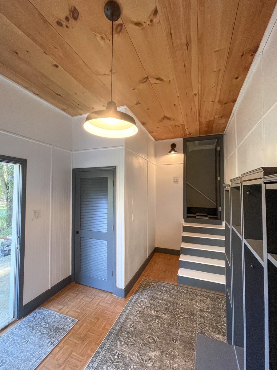
We built our guesthouse before we started to build our house 20 years ago. We wanted to be on site and live in it while the house was completed. Fun fact, prior to that we lived on our boat for 10 months. That was before kids and it was easier to do things like that. The guest house was primarily designed for our family and friends to stay for the longer then usual visits. I have done an okay job with some of the updates to the space over the 20 years but apparently not the entryway. A little time and paint changed all that. Throw in a few new rugs and lighting and the space is good to go.
The hideous before
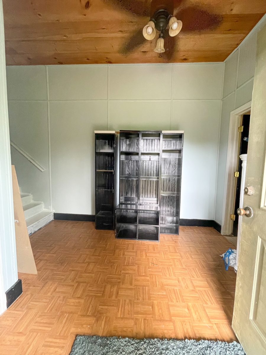
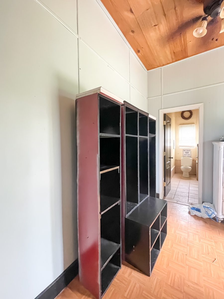
The prettier after
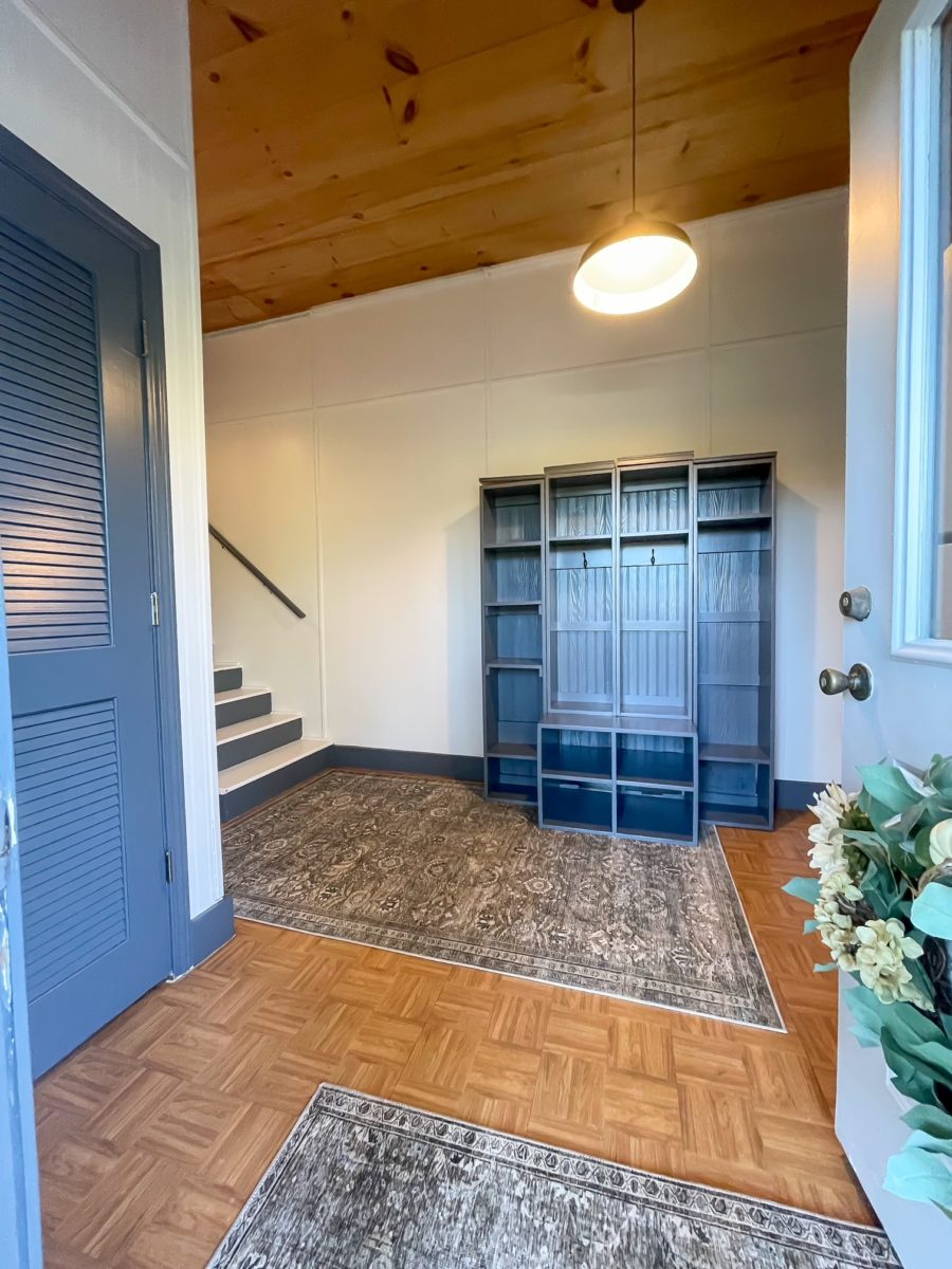
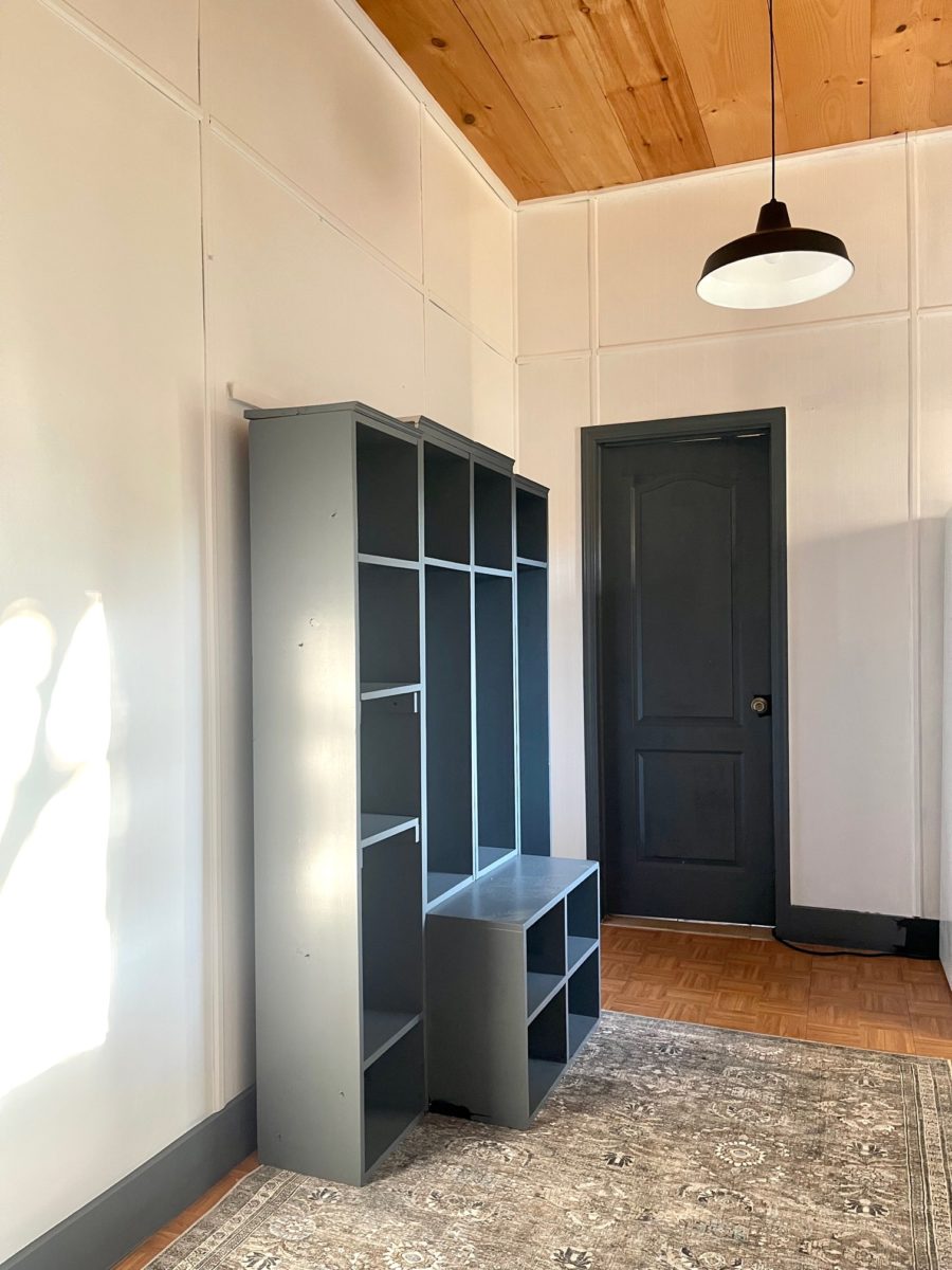
The walls were a left over light blue that I painted over with a couple coats of pure white paint. I really liked the look of the ceiling that I painted here, so I decided to use that same color ( SW Web Gray) on the doors, trim and lockers. The only area that I didn’t paint was the ceiling. I like how the wood tone works with the floor.
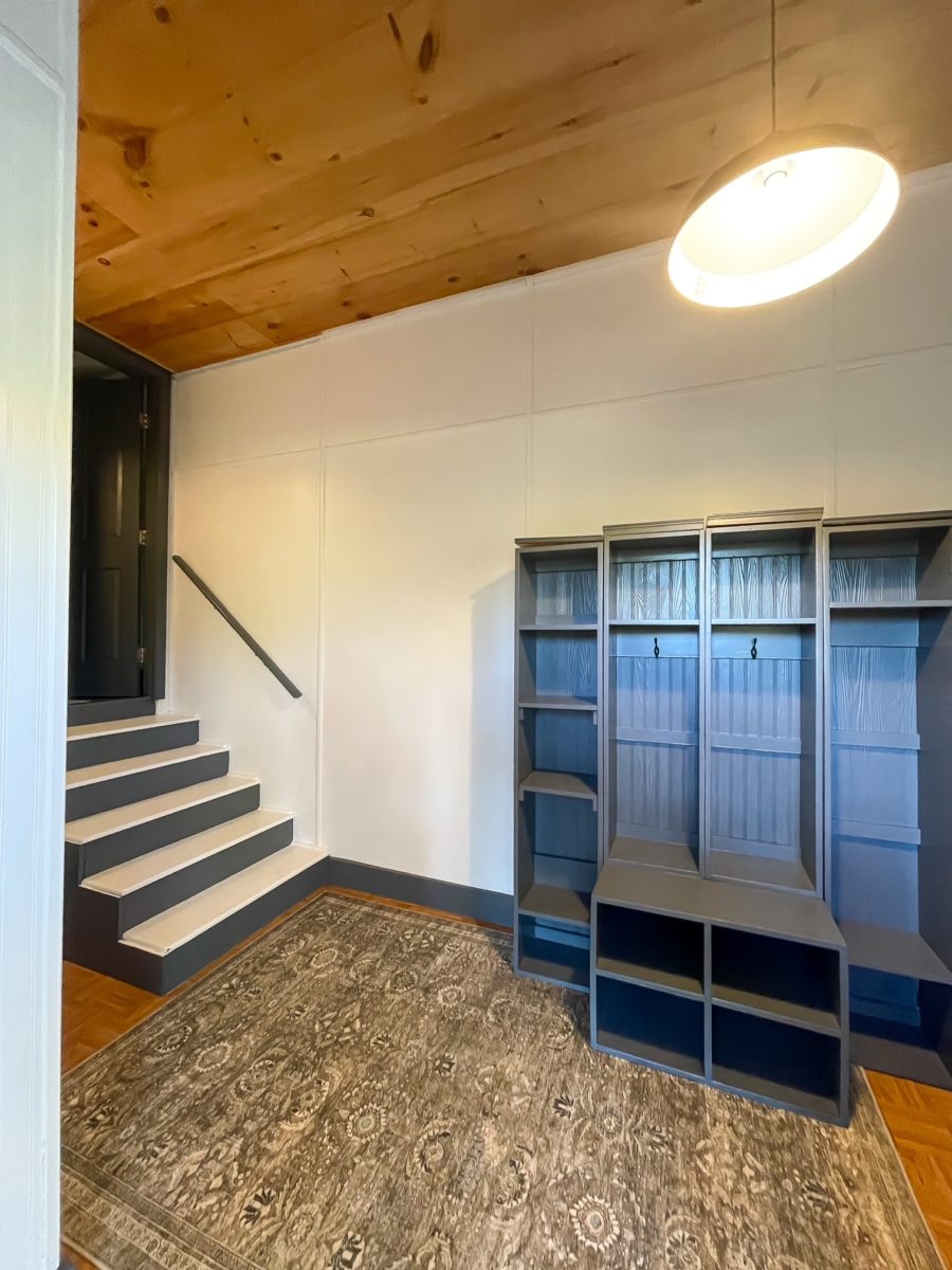
I changed out the ceiling for a hanging warehouse pendant and replaced the small light for this light going up the stairs. I like the way the black finish gives the space a more modern vibe. Both lights cost me less than $75.00.
The stairs lead to the main area in the guest house. This space also has a laundry room and bathroom which you can see in the above before pictures. I will be tackling that space next. The rugs in Antique/Moss are a favorite from here. I have these rugs in other colors in my family room, kitchen and Dining area. Best rugs ever and you can’t beat the price!
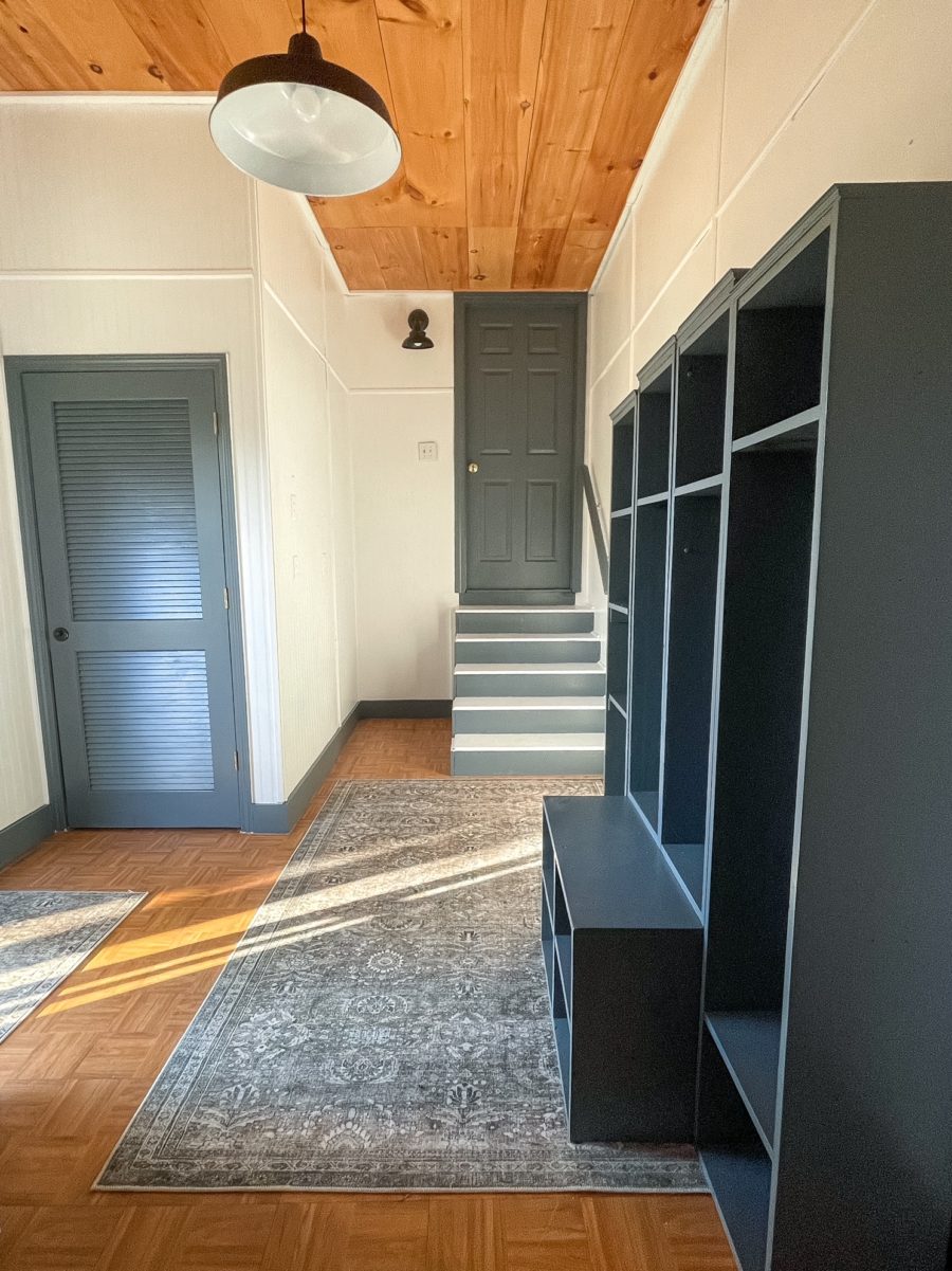
I still want to hang some art work but for now I am super happy how this space turned out. Now my guests will have a much better greeting when they come to visit.
Cheers to cringe worthy spaces and giving them some TLC!

This post may contain affiliate links for products that Duke Manor Farm uses, suggests or recommends to it’s readers.

Beautiful Update!
thank you!