Dining Room Refresh
I had every intention of sharing the reveal of my Dining Room Refresh that I started before Christmas well before today, but an 11th hour change of heart messed that plan up and so instead of showing you a finished Dining Room Refresh, it’s more of just an update. Not being finished with the space really doesn’t surprise me, because this room for whatever reason, has been a bit of a challenge for me when it comes to being content with the design. It’s a room we rarely sit in, yet it’s the first room you see when you walk into my home from the front door, so I want it to look pretty, styled and complete. You can read more about my challenges with this space here.
The whole idea about starting the Dining Room Refresh happened back in November, when I contacted Pottery Barn Design services looking for some assistance with a room design, and shared a picture of my Dining Room. I was hoping that by the New Year I would finally be happy, finished and content with the space. I am almost all of those things. Not sure what I was thinking about getting it done in 30 days, when it’s been a work in progress for 15 years.
This is the photo that I sent them.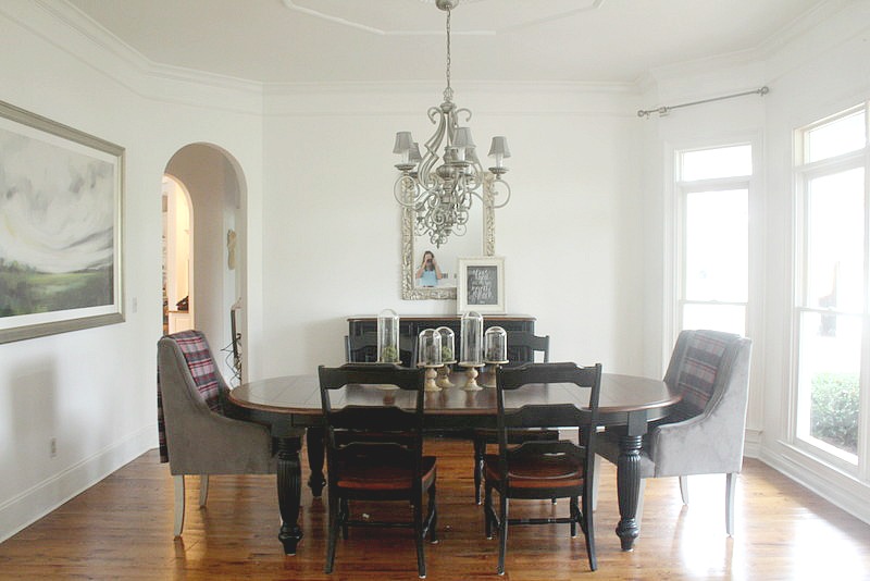
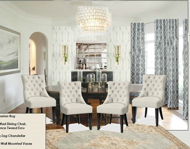
This is the Design idea that they came back with. If you are not familiar with PB free Design Services, basically you share your room image and your expectations, and they will send you back a design board with some recommendations. I told them that everything in the room could go, except for the table, buffet and picture. I decided to use the service for two reasons. One, I was desperate to finally pull the room together and two, I assumed I would probably be buying everything from PB anyways. Which I did…..almost.
Here’s what the Dining Room looks like now with some of the changes.
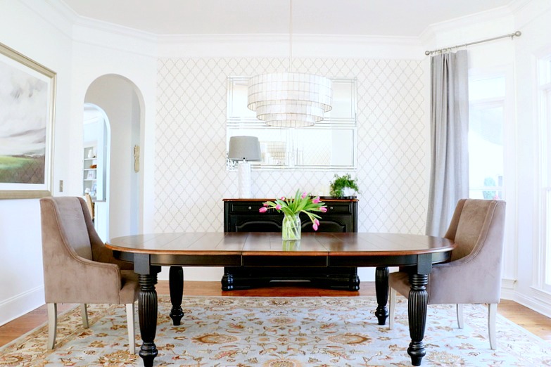
Directionally, I really liked what they put together for the room. With using my existing traditional table and buffet (which is too expensive to repurpose, giveaway or put in storage), I wanted to add a bit of modern glam to the space without spending a fortune.
I did make a few changes along the way using their plan as my inspiration.
Curtains- Unfortunately the Kendra Trellis Pole curtains that they recommended (which I loved) where not available in the size that I needed. So, I went with the PB Emery Linen solid panel in Blue Dawn.
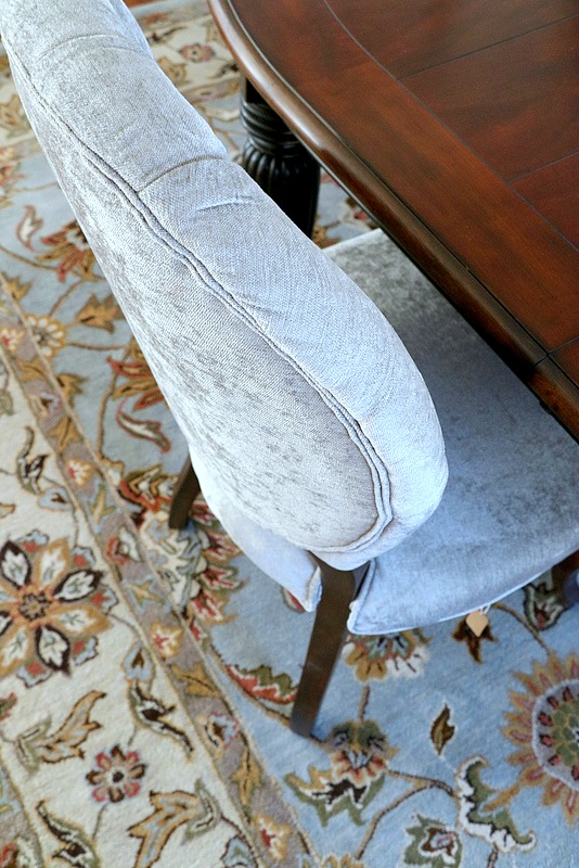
Flooring. I originally ordered the rug that they suggested, only to be called 2 weeks later, to tell me it was no longer in stock and discontinued. Boo….I really liked the rug they suggested, but fortunately for me, found this one at Rugs.com that I like just as much…… and for quite a bit less.
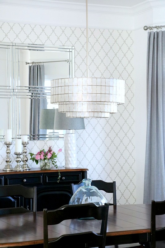
Lighting. I love the chandelier that was in the design, but found a similar one from West Elm….that I also really like.
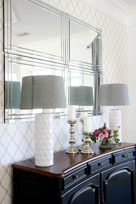
Wallpaper. Because I mentioned that I wanted to create a focal point with interest and pattern, the initial design plan recommended wall panels ( think fancy, pricey, contact paper) from West Elm. I ordered a 2 foot section in a palm leaf pattern. I liked the pattern, but it just wasn’t the right color. It was a bit too blue green for the space. So I looked around and found this paper at Wayfair. It is a taupe gray and is neutral enough to go in any direction. I liked it so much that I not only did this focal wall in the Dining Room, but also the adjacent wall in the entry.
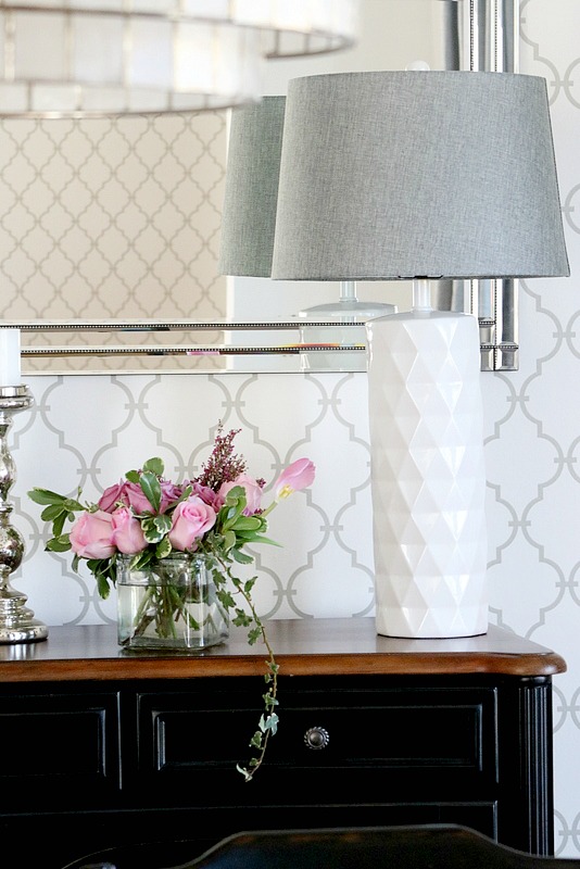
Mirrors. PB recommended their Eagan mirror which is lovely, but at $700.00, that just wasn’t going to happen. So on one of my very few trips into a HomeGoods, I found 4 mirrors that I hung close together, to give the illusion that it’s one piece, and it was about 1/3 of the cost. I think I paid about $70.00 for each mirror.
Seating. So far, so good…..except my 11th hour change of heart…..the seating. I don’t think the originally chairs to the set work with my modern direction, so I will use those chairs in the guest house. The two end chairs that I have had for a couple of years, don’t really work with my vision for the space. (I am going to sell the two Gray end chairs, so if you are local and interested in them, PM me so we can talk) Although PB’s chair recommendation is pretty, I wanted more of a rounded back, so I found this tufted dining chair at Pier 1 and now, I am thinking about just doing 6 of the same chairs and not doing different chairs for the ends.
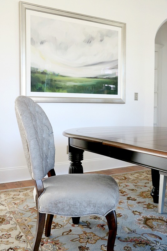
So, there’s were I am at with my Dining Room refresh. Stuck at seating…… which ironically, I may have to just sit down and think about it.
Hope you have a lovely week!

grateful
for change…15 years later



It’s looking good no matter how you slice it. And I like your blue glass jug, I have the same one in amber – a gift from my daughter.
Well, poor Pottery Barn only sold you drapes! Looking good. What a smart cookie you are making your own version of the mirror. Ones tiny suggestion, I would either hang two more of those mirrors at the bottom or lower what you have. Little too high and needs to be connected more to the buffet. Look at the PB version. Don’t shoot the messenger. 🙂
i love that suggestion. Hopefully they will have two more. If not should i move the four down?
Love the changes, I think your take on their suggestions is stunning and much more pleasing to the eye. Great job so far.
love what you’ve done and i prefer the solid curtains so much better anyhow- i didn’t like how their plan broke the space up with white wall, wallpaper, then patterned curtains- the balance was all off. the solid is much better!
I LOVE what you have done so far…from that awesome focal point wall (great design) with that wonderful grouping of mirrors (smart!) and that gorgeous chandy….You certainly have taken their design and made great choices for less money….love the chairs…Looking forward to more of your dining room refresh!….Beautiful, beautiful Laura!
I guess if you move the mirrors (which I think were a great idea) you have to hammer more nails in that wallpaper. I don’t have any problem putting nails in painted walls. But I cringe at the thought of doing the same with wallpaper. Well, I’m not very good with formal, so the other ladies will be more help!
Brenda
Love the new chairs…it all looks great! I agree about the mirrors being moved down, but if you can’t find more can you change the direction that these hang? So that they hang longer top to bottom? Because that would make them longer and narrower like in the inspiration pic…some of my mirrors can be switched like that and I can use the nails already there. I hate filling holes, lol!
Pretty so far! Can’t wait to see the final reveal!
🙂 Linda
It all looks very beautiful!!! The furniture is gorgeous and lends a nice contrast for the room. I do like the plans that PB came up with, but I have to say that I think you made a better selection for the drapes, and then putting the paper on the wall. Drapes with patterns always catch my eye, but I get tired of them very quickly. At least with your selection if you ever feel the need to “switch things up”, you’ll be able to do so without having to worry about that expense! It’s beautiful, Laura:)
Looking good, Laura! Love the layers that the rug and drapes have brought in!
xo Heidi