The Rest of the Story of the Breakfast Area
This poor room had been through a lot… I actually felt sorry for it.
A lot of paint changes, color changes, rug changes, accessory changes and furniture changes.
All for good reason though….see this poor room had a case of mistaken identity.

When we first built our home, this room was designed as our Family Room. It was right off the kitchen, central to the house and has a nice big fireplace to cozy up on the couch. It completely made sense to us and made us comfortable on that couch in front of the fire, over the course of 7 years in the house.
And then something happened as we entered into our 8th year. It occurred to us that maybe the room was a design blunder, that maybe it would be better served in the room that was originally designed as our sunroom. You can read about that here. So we began the transition of creating what once was our family room into an extension of our kitchen, which is now our breakfast area.
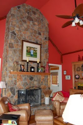
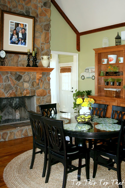
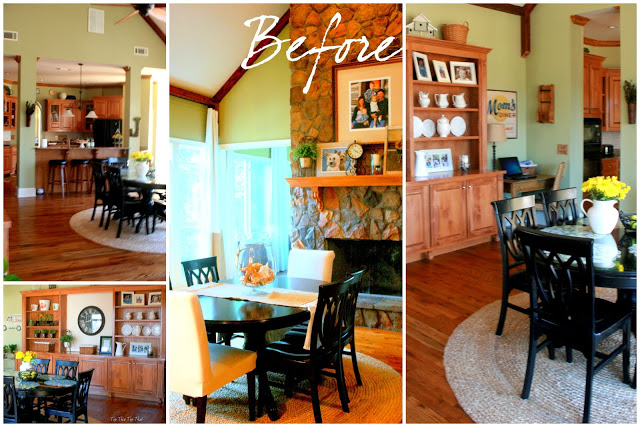
During the last few years I have tried to make a space that really wasn’t intended to be a kitchen seem like part of the kitchen. Truthfully it wasn’t easy. Color was a huge challenge and after four changes (here) I am confident that this color is meant to be in this space. This was the space with the previous color.
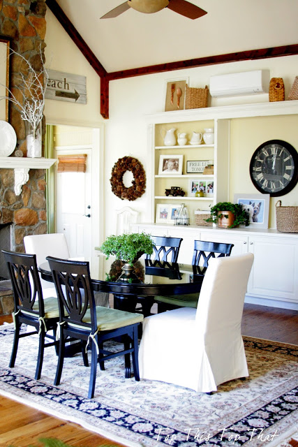
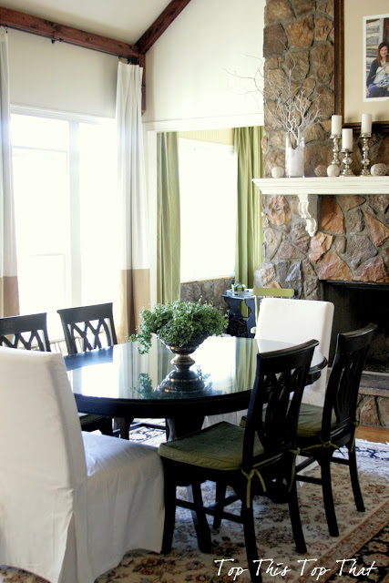
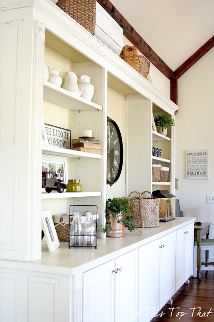
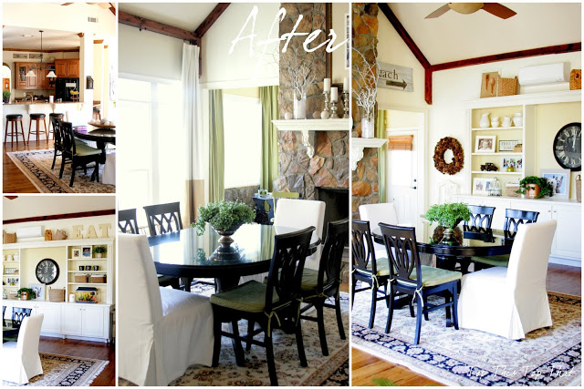
Next it was time for the mantle (here) and built-in cabinets (here) to get freshened up with a lighter color as well. The contrast between the wood floors, ceiling beams and the lighter cabinetry just works in this space.
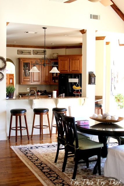
This is the view looking into the kitchen. I am working on a few other “minor” changes that will help to create more brightness in that area. You can read more about my “quest” for brightness not necessarily whiteness here.
Looking back from where we started, I am beginning to think that this blunder wasn’t so bad after all.
In fact if blunders can look and act this good, maybe we can hang out and do things more often.
Grateful for~
Want Top This Top That delivered directly to your inbox?




It looks great!
Now it knows its identity for sure. Beautiful.
I love, love this space…you have brought it to a new and gorgeous level…I am thinking that it must function so much better for your family!…
Happy Valentine's Day!!
Love love love the change!! You created such a beautiful space Laura! Happy Valentine's Day:)
The change is perfect! I love what you have done with the space!
Happy Valentine's Day!
You've created a beautiful, beautiful space. I love all the changes that you've made. Amazing to see the befores.
I think you've hit the nail on the head with your current design. The colors are perfect and bright…it reminds me of an English home.
I don't want to offend you but that before not even looks like your Home.
Sorry.
You're for the Light and romantic and chic accents… So glad you improved the Space SO MUCH and decided to share with us. I think you always had – deep inside – this actual idea all along but other things were priority back then and now you have the time needed to play with what you like and can achieve. Inspiring!!!
Blessings of Love on Valentine's for you and your loved ones.
Laura,
Seriously? That first picture looked straight out of Pottery Barn! You go girl! That room is smiling from ear to ear!
Happy Valentine's Day to you!
karianne
Laura, please come back to Houston and redesign my house. You are so talented. Sheree
Laura- It is a perfect transition! It works beautifully and I love that it really seems to have been made for a dining area- Great job!!!! xo Diana
I love the lighter, brighter look! Just gorgeous!
It's perfect. I love the light color! Beautiful!
I love it! You're so blessed to have such a gorgeous space. I love it light and bright too! Great job.
I have always dreamed of a fireplace in the dining area…you know..like Cracker Barrel. It is beautiful and I love the color.
What a great space. It looks so warm and inviting!
Love that you captured such great "before and after" photos! It looks fabulous … oh to have a fireplace in our breakfast room!
You have such beautiful taste. The room looks gorgeous! Warm, inviting, light filled and full of interesting pieces. I love what you've done 🙂
This is an amazing room! I love how bright it is and you have such a talent for making it feel like such a comfortable home.
Wow – Laura it looks fantastic – a perfect storm of blunders! And I love being able to see the view back to the kitchen, I had myself reversed! Take care, Laura
Laura, this room is gorgeous!! I am in love with that cozy fireplace and all of your airy bright whites!
Such an amazing transformation! I love seeing how much of a difference paint can make. I think my family room was once that same shade of red and then it also went to green. Now it's tan, but this is making me want to paint the walls again!
Perfect! Definitely inspiring on the color! I have had a can of the same color but too scared to go to what I felt was a "plain" color! I can't wait now! It is a gorgeous color and gorgeous room! XOXO! Reb
I SOOOOOOOOOOOOOOOOOOOOOOOOOOOOOOO love this new space…AWESOME as is everything you touch!!! applause!!!!!! hugs…
Glad that it turned out to be a blessing in disguise! I know it would feel nice to eat beside a warm fireplace. That's a nice big eating area now.
I think you got the right look this last time…at least for now until your taste changes. LOL
Enjoy this lovely space!
What a great idea! Please share it on a terrific linky – Design Décor Tuesday. http://www.designdecortuesday.blogspot.com. See you there! ☺
What a wonderful transformation! It must be wonderful standing in the kitchen and seeing such a lovely breakfast room.
I'd love if you'd come join my How To Tuesday link party, too.
http://housewifehowtos.com/link-party-2/how-to-tuesday-link-party-9/
– Katie B. of HousewifeHowTos.com
the room looks so great! what a diffrence! Amazing Job!
Holy Cannoli, I can't believe this is the same space!!! It looks awesome! I LOOOOOVE the built ins. And you have them staged perfectly!!! It is all gorgeous. XO, Pinky
Great transformation!
Ohhhh it is just gorgeous!!!!
Thanks for linking up.
XO
kristin
I love the lighter colors! Having a fireplace in the room reminds me of those lovely keeping rooms. I think you made a great choice in switching this room over. Nice job!!
Beautiful space and I love that you are using it exactly the way that you want to!
What a pretty transformation to this room–I love the dark chairs with the newly lightened and brightened cabinet–so crisp and stylish!
Your new breakfast room is so bright and beautiful. Sure makes sense to have it right next to the kitchen. And what a great perk to have the fireplace in the breakfast room!
Mary Alice
Love it! Just gorgeous!
Absolutely gorgeous Laura! That room is just perfect now….I love the warmth of the fireplace, the airiness of the white and the statement of the black furniture! Just perfect! Wishing you a lovey week! Angie xo
Gorgeous – love the color with the fabulous wood floors! And that fireplace! I'd love to sip wine in front of that baby!
Kelly
Your room looks fantastic! What a hubby you have, I believe he's a keeper.. hugs ~lynne~
Looks beautiful!!!
Oh my, what a fabulous space and it looks wonderful. I love the beams, built-ins and the table and chairs are perfect. So pretty. Hugs, Marty
OMG – very well done, you really did a fabulous job changing and growing into this space.
Good for you- it looks AWESOME!!!!!
Beautiful change! You have an amazing room!
Beautiful and perfect dining area. Looks great and love the colors.
It looks like it was meant to be! Gorgeous. 🙂
If that was a blunder, you've certainly made the most of it — absolutely beautiful!
Absolutely beautiful! You have such great style, Laura. (And that fireplace is perfect in your dining area.)
AMAZING transformation! Fabulous job!
You really made it into a breathtaking space! I love it!
Great Transformation!
Wow…LOVE it! The cabinetry and high ceilings are so beautiful♥
Gorgeous!! You have really brightened up the space. That wood trim is fabulous. Amazing job, Laura! I know all that painting had to be a huge undertaking!
Absolutely beautiful room! I'm contemplating a change like this but haven't acted on it yet. You've motivated me!
I love how you painted the inside of your built in shelves!
Hard to believe that is the same space! Gorgeous!!
You dining room is gorgeous! It is so light and airy, yet it has so much texture and color. I would be honored if you took a chance to share this on my linky party. ttp://suburbsmama.blogspot.com/2013/03/sunday-linky-party-1.html
Oh my Gosh Laura! The transformation is stunning! Worth all the changes in between for this great result! Love, love, love it!
Very, very clever and beautiful! I love that fireplace I'm sure it's heavenly to have breakfast there on a cold morning! Like your paint color choices, too.
Just found your blog and love it!
XO,
Jane
I just went through this post for the second time today when I saw it on Blogger Homes and was blown away AGAIN! What a difference paint makes. And I adore this space.
Great job Laura!!!
Wow the transformation is beautiful!! Looks so light and new and fresh! I'm your newest follower!